Option lists
Option lists in Innobrix
The option list can be found within the Configurable Editor. To initially access this environment, you must first have a model
have imported a model within the platform. A new imported model is automatically (data-technically) linked to a new option list after import. You
can also choose to use an option list based on a CSV file coming from your CRM or ERP.
The option list is an essential part of Innobrix Studio and allows you to intelligently exchange your Model Groups
be able to exchange your Model Groups based on options. You do that by establishing a relationship between the options within an option list and the Model Groups present
within the bag field of your model.

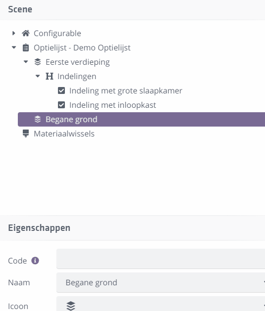
Structure of the options list
Category
The options list can contain several main categories. You can use predefined category standards here
such as Division or Sanitary. However, it is also possible to add your own category by clicking on the Name field of
a category and then entering the desired name. For each category, an icon can be chosen to style it. Finally
still be chosen to add an (optional) category description.
 You can create a new category in the option list by right-clicking on
``Option list`` and then choosing `+ New category``.
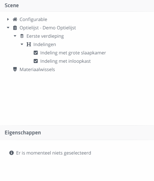
Header
Within these main categories, an indefinite number of Headers can be added. These headers have a name property
and (optional) description that can be filled in. Headers are suitable for creating clearer structures within a category.
 You can create a header under a category in the option list by right-clicking
on a `Category` and then choosing `+ New header`
Option(s)
Finally, you have the option to add an indefinite number of options under a Header. Options are the elements in your
option list that you need to associate with your (option) Model Groups. In addition, options contain a wide range of properties, such as name,
price, type, logic fields and more.
 You can create a new option under a header in the option list by right-clicking
on a `Category` and then choosing `+ New header`
Option Type
Within Innobrix, 4 option types can be distinguished.
- Checkbox
- Radio button
- Thumbnail
- Color
In addition to how an option is displayed visually in the option list, the option type chosen can also affect how an option responds.
Deleting option list elements
It is possible to remove categories, headers and options from the option list. This can be done in 2 ways.
- By opening the context menu on a specific element in the option list via the right mouse button and choosing
Delete. - By selecting the element in question and then hitting
Deleteon the keyboard.
When deleting categories or headers, all nested elements under that particular element are also deleted.
Note when deleting options that it may be possible that these options are already linked to some Model Groups.
Removing these options then expires on these groups so the groups may no longer respond or be set properly!
Options
Functional and Sales Options
Besides the options you are going to offer to the buyer, there are also groups in the bag field that have to do with the practical functioning
of the model. For example, consider end facades that are included as Model Group in the bag field, but will not be a selling option for your buyer.
(After all, you can hardly offer end facades for both intermediate and end houses). So these types of Functional Options do need to be included in the option list
to use for option mapping, but will almost never be present (visible) to the end user within
the option list for them to choose from.
There are 2 places where you can make an option invisible:
- From within the option list itself.
- Per lot (in the
Plan-Editor) it is possible to set the visibility of certain options.
When you make options / categories invisible from the option list it will be invisible for all lots (for the end user). So adjusting invisibility of an option or category at lot level will only apply to that specific lot.
Option Properties
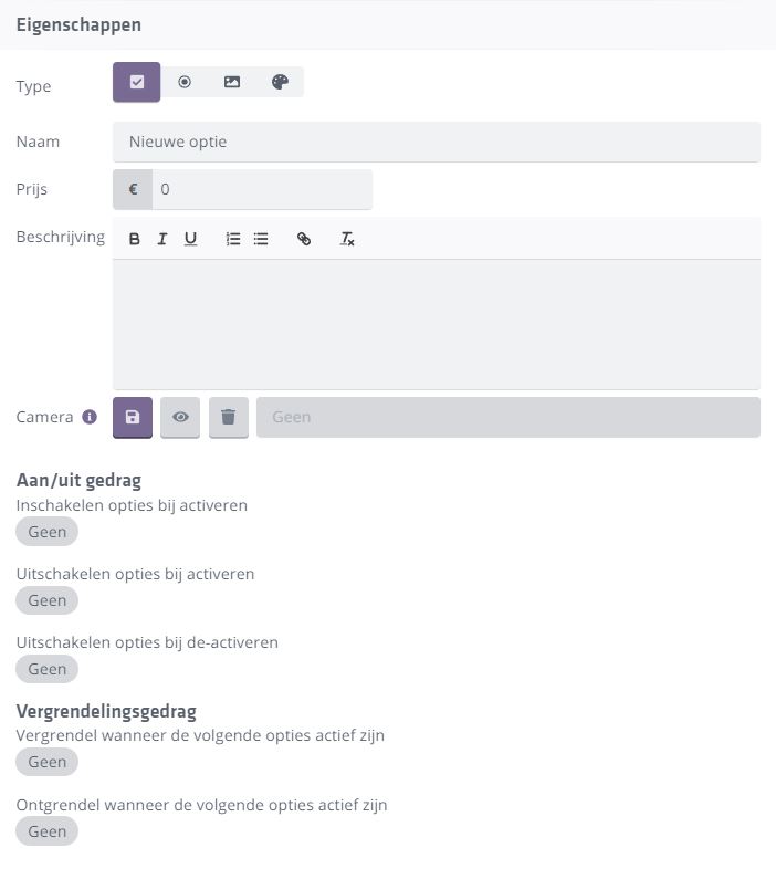
Type
- Checkbox: Can be turned on and off.
- Radio button: Can only be exchanged for another Radio button under the same header. Basically cannot be turned off.
- Thumbnail: Behaves the same as a Radio button, but possible to show a picture instead of the round bullet.
- Color: Behaves the same as a Radio button, but possible to show a color instead of the round bullet.
Name
The name of an option as shown to the end user.
Price
The price of an option in the selected currency. (Default in euros (€))
Description
The description of an option. You can see this description in the Viewer as soon as you click on the .
Camera
Allows you to visualize the respective option by defining a camera viewpoint. See also: Option Focus.
On/Off behavior
Allows you to set the on/off behavior of a given option based on other options. See also: Option Logic and Option Mapping.
Lock behavior
Allows you to set the locking behavior of a given option based on other options. See also: Optielogic and Option Mapping.