Option lists
Option lists in Innobrix
The option list is found in the Configurable Editor. To get there, first import a model into the platform. A newly imported model is automatically linked to a new option list (data-wise).
You can also choose to use an option list based on a CSV file from your CRM or ERP.
The option list is essential in Innobrix Studio and lets you intelligently swap Model Groups based on options by linking options in the list to Model Groups in the model's gridfield.

Option list structure
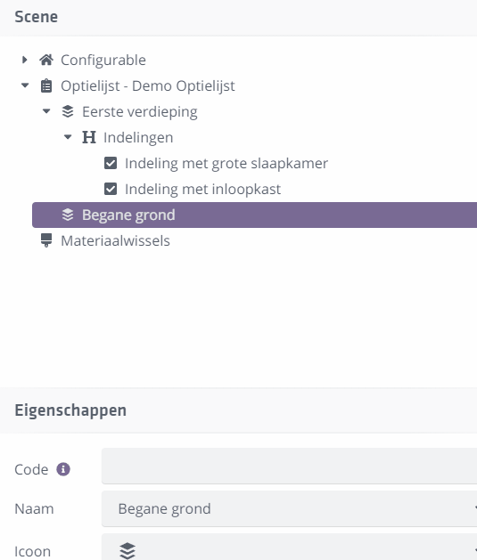
Category
The option list can have multiple top-level categories. You can use predefined category standards like Layout or Sanitary. You can also add your own category by clicking the Name field of a category and entering a name. You can choose an icon and optionally add a category description.
 You can create a new category in the option list by right-clicking
`Option list` and choosing `+ New category`
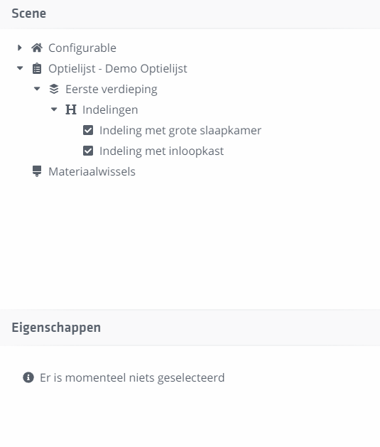
Header
Within these categories you can add any number of Headers. Headers have a name and optional description and help structure a category.
 You can create a header under a category by right-clicking
on a `Category` and choosing `+ New header`
Option(s)
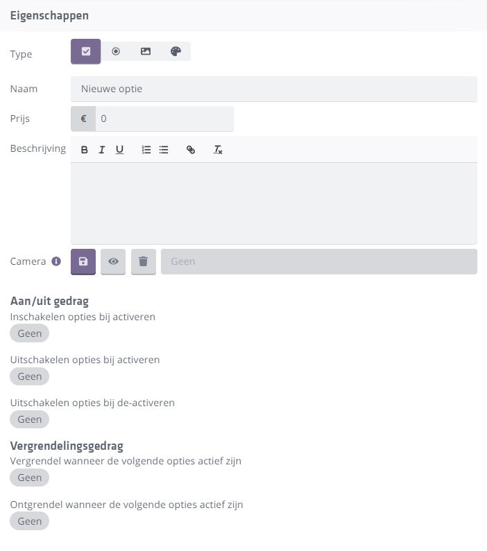
Finally, add any number of options under a Header. Options are the items in your option list that you link to (option) Model Groups. Options also contain many properties such as name, price, type, logic fields, and more.
 You can create a new option under a header by right-clicking
on a `Category` and choosing `+ New header`
Option type
Innobrix distinguishes four option types.
- Checkbox
- Radio button
- Thumbnail
- Color
Besides how an option is displayed in the list, the chosen type can affect how an option behaves.
Deleting option list elements
You can delete categories, headers, and options in two ways.
- Open the context menu on a specific element (right-click) and choose
Delete. - Select the element and press
Deleteon the keyboard.
Deleting categories or headers also deletes all nested elements beneath them.
When deleting options, remember they may already be linked to Model Groups. Removing them drops those options from the groups, which may cause groups to behave incorrectly.
Options
Functional and Sales options
Besides options offered to the buyer, there are groups in the gridfield related to the model's practical functioning. For example, end walls are included as Model Groups but are not sales options (you do not offer end walls for both mid-terrace and end units). These Functional Options should exist in the option list for option mapping but will rarely be visible to the end user in the option list.
You can hide an option in two places:
- In the option list itself.
- Per lot (in the
Plan Editor) you can control visibility of specific options.
If you hide options/categories in the option list, they are hidden for all lots (for the end user). Hiding on lot level only affects that lot.
Option properties
Type
- Checkbox: Can be toggled on/off.
- Radio button: Can only be swapped for another Radio under the same header. Cannot really be turned off.
- Thumbnail: Behaves like a Radio, but can show an image instead of the round dot.
- Color: Behaves like a Radio, but can show a color instead of the round dot.
Name
Name of an option as shown to the end user.
Price
Price of an option in the chosen currency (default euros (�)).
Description
Description of an option, visible in the Viewer when clicking .
Camera
Define a camera position to bring the option into view. See also: Option Focus.
On/off behavior
Set how an option turns on/off based on other options. See also: Option logic and mapping.
Locking behavior
Set how an option locks based on other options. See also: Option logic and mapping.